


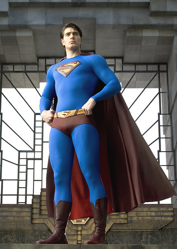
He's Superman, not a male stripper!
I’m sure by now, many of you have gotten a glimpse of this photo posted on Singer’s website, The Blue Tights Network , as it has made its way around the web rather quickly.
I’m already dubious of Singer’s direction with this movie, concerned that he doesn’t show enough enthusiastic geekiness about the fact that the current fate of THE American comic book icon is in his hands. Much like the Batman franchise, by the time the last Superman movie came and went, the initial excitement of the fan base had died down, and after a fantastic start, the quality had petered down into foolish campiness. Now its up to him to reinvigorate and revive it with ingenuity and a new take, like Chris Nolan is doing with Batman Begins.
This costume, however, does not promise alot in the way of reinvention. It looks pretty identical to the original comic book concept of the costume, but those little red briefs are reading a little too male stripper to me than they ever did before. This costume needs to be updated, as was done with the Spiderman and Batman costumes.
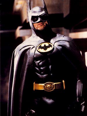
The first redesign of the Batman’s gear that Keaton donned was great because it still incorporated the yellow and black Batman emblem but was a lot more masculine and ferocious looking. Can you imagine if Keaton had to run around in the same costume, the gray bodystocking with flimsy cape like good old Adam West did?
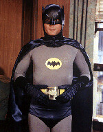
No way Jose. While that flew in the Pop Art infused 60’s it certainly did not fly in the 80’s/90’s and costume designer, Bob Ringwood, obviously knew there was some major work to do. Ringwood had to keep the essence of Batman while creating it for a new era. In my mind he did a fantastic job.
I thought that the Spiderman costume, which was also basically one large body stocking looked great in Spiderman 1 and 2 as well. Costume designer, James Acheson, gave it some great texture, and all the webbing sewn onto it gave it the illusion of “thickness” so we didn’t feel like Tobey Maguire was just slipping into a big red nylon pantyhose.
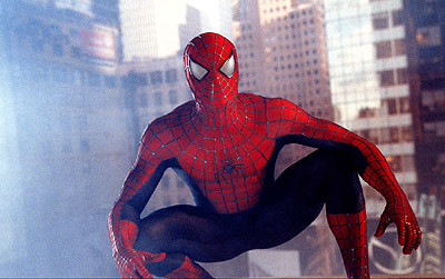
The way the did the colors for Spidey’s suit, also drew attention away from certain…uh…areas, bright red on top, navy on the bottom. The costume is really a fairly dynamic piece.
Here in a side by side comparison, you can see how similar the Superman costumes are.

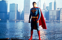
Strange that what seemed perfectly normal in 1979 stands out in 2005. I have no problems with the fact that Reeves wore that costume in the beloved Richard Donner orginal. Maybe its because things were more innocent back then, maybe its because I'm just so used to the look of it. But what's the point of reviving a superhero franchise anyways, if you're not going to have a new take on it. Modernization comes with the territory.
This new superman costume is just too plain. I also find myself blushing and looking away from the image in as I can see details of his package through the costume. This is Superman we’re talking about here, I shouldn’t feel embarrassment for him! Something a little more modest I think is in order here.
It looks very blocky in its color scheme, and some more elements, perhaps on his shoulders and his legs so it doesn’t look so tight and two dimensional. Oh boy, this does not bode too well. Singer, get in the game man!
Maybe this rant is all for not. Maybe Singer is just putting out this image so all the bloggers will freak about how unchanged it is, and then 1/3 through the movie, Clark Kent's apartment will burn down and he will loose this costume and get a newly revamped one.
Here's to hoping.
posted by Kalinda @ 1:55 PM
![]()
![]()
0 Comments:
Post a Comment
<< Home